Greatsoft

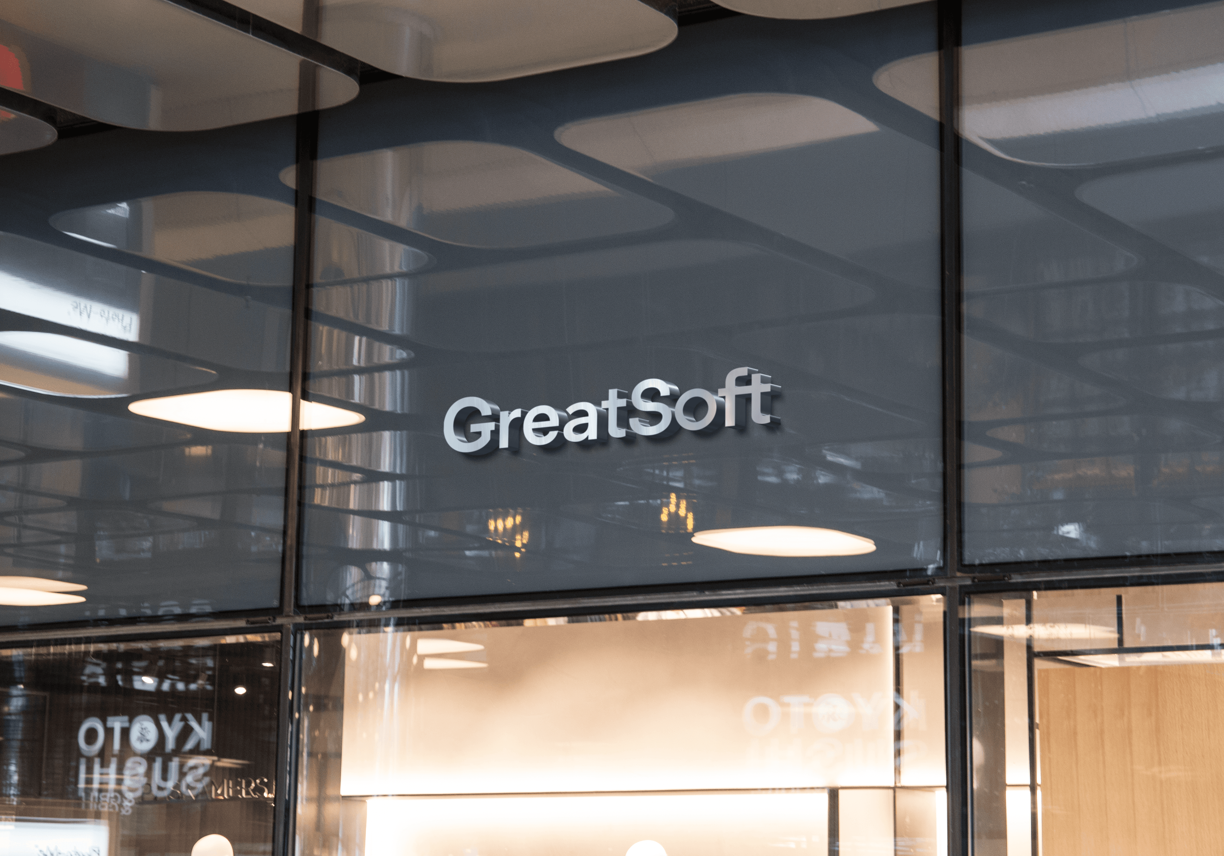
At the beginning of 2026, we led a full rebranding for GreatSoft, developing a structured and practical corporate identity system. The objective was to formalize clear guidelines for logo architecture, color hierarchy, typography, tone of voice, and graphic elements to ensure consistent alignment across every touchpoint. The GreatSoft Corporate Identity translates the brand’s defined personality professional, confident, and approachable into a cohesive visual and verbal framework that supports clarity, recognition, and consistency across product, digital, and print environments for internal teams and external partners.


Process
We began by translating GreatSoft’s defined personality into clear visual and verbal guidelines that reflect a professional, confident, and approachable brand. A structured brand book was developed to document each component of the identity system with practical rules to support consistent day to day application.
The logo system was formalized with defined architecture, usage principles, clear space requirements, minimum sizes, and misuse guidelines to preserve integrity and legibility across all contexts. The color hierarchy established blue as the dominant brand color, supported by controlled accent tones and approved background recommendations to ensure visual consistency.
Typography was standardized using Sora as the primary typeface, with clearly defined hierarchy, scale, line height, and spacing rules to maintain clarity and readability. Arial was specified as a fallback in environments where Sora is not available.
Sum up
The completed brand book provides GreatSoft with a practical and scalable foundation for consistent visual communication. By documenting and formalizing the core identity elements, the rebrand ensures the brand presents itself with clarity, structure, and recognition across all touchpoints.
© Useless Button DOO